Saturday, 9 March 2013

The Lilac Fairy


After seeing Matthew Bourne’s production of Sleeping Beauty at Sadler Wells in January, the fairy costumes alone were one of the elements that inspired me to do this collection. The skirts a soft light weight fabric that started in color then descended into darker shades at the hem were gorgeous, making them gritty yet ethereal.

The Lilac Fairy in most interpretations of Sleeping Beauty is seen as this wise guiding figure for the two protagonists. I disagree-she’s not really a ‘Good’ Fairy, unless by the word ‘Good’ you mean ‘Ok’ or ‘Fine’. In averting Carabosse’s curse, all she really does it complicate things, making everyone in the castle comatose for a century! 


The overall concept for this character is Narcolepsy. In staying true to the character’s title I knew purples would be a major color choice, but like the New Adventure costumes I loved the fusing of the brighter color on the corsets transforming into black tones by the edge of the skirt hem, as if suggesting the gradual descent into sleep. This was where I thought of a light colored bodice that would shift into darker shades through the billowing layers of a massive gown. Also for this design I reincarnated my ‘The Dog Ate My Prom Dress’ technique I made up a few years ago, taking layers of gathered fabric and shredding it’s edge. The effect looks as if the dress’s been dragged through the hedge.
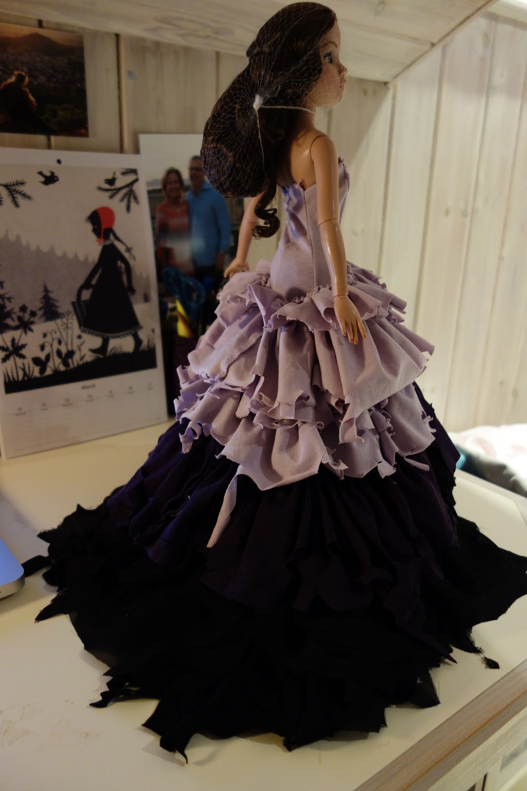

The light weight and volume of the gown came out beautifully, particularly the darker violent between the lilac and black layers making a smooth transition in the color palette. However the weight of the skirt was so heavy, I had therefor reconsider the sleeveless bodice idea. The ruffled halter top Mila Kunis wore for the cover of Sunday Times Style magazine inspired me to compromise the shredded gathered ruffles in the front to hide the halter additions, the ruffles merging at the waist line with the rest of the skirt! The effect is much more editorial than my original design. 


The mask was inspired also from the eye make up of the fairies from the Matthew Bourne production, the black strip making a mask like shape around the eyes. The idea intrigued me as it seemed to suggest sleep, so I redid it into a physical mask with black netting, in the style of the headwear worn at ascot covering the face. 

Saturday, 23 February 2013

And the Latest Collection is...


Fairies! 
Yep, after positively basking in the glory of the ballet season here in London, I’ve been inspired by the wide range of fairy mythology. In our ideology, sometimes they’re these tiny little beings of light, there to guide or assist us. Other times we humans really wouldn’t wanna get on their bad side. I mean, just look at Malificent from Disney! (Yes, few know this, but yes, she is in fact a fairy.) 
Bad and good. Ha-kinda sounds like us humans, don’t cha think?
Still, I’m really intrigued by their individuality and their symbolism. So I sat down and made a list of the most prominent fairy figures today, from movies, literature and general fantasy. It came down to these lovely ladies:


The Fairy God Mother 


The Blue Fairy from Pinocchio


The Lilac Fairy from Sleeping Beauty 


Tinkerbell


The Sugar Plum Fairy


The Tooth Fairy


and Titania from Shakespeare's A Midsummer Night's Dream

Each of these fairies is viewed today with mystery and the allure of fantasy, yet they  all have such different characteristics!

I’ve been perfectly my pattern making skills finally by making sample pieces first from stretch fabrics. It’s been a great way to test the waters, seeing what could be longer there, of what would look here etc. From this process this gorgeous ball gown pattern has come into existence. My plan is to use this pattern as a template for fairy, the wide fanned out skirt itself acting as a canvas onto which their individual characteristics will be represented, twisted through my own interpretation. 

Saturday, 16 February 2013

Asian Fusion Collection


While I’m coming up with the patterns for my hinted new idea for a project, I’d thought I’d go back and fill y’all in one some more of my past work. 


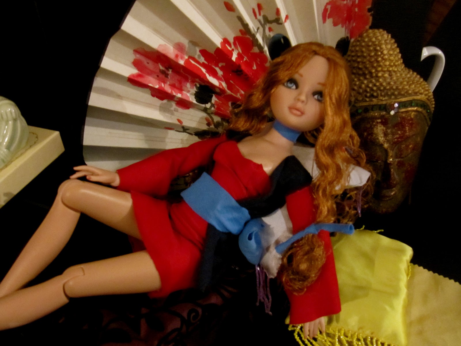
Asian Fusion came into existence when I started to really get into America’s Next Top Model two years ago. Watching Cycle 13, I was really inspired by the female warriors’ feel from the ‘Ninja on wires’ photo shoot, the mesh of on trend style with traditional warrior wear. It gave me the idea of using clashing colors for outfits that take elements of traditional asian clothing, such as the wrap coats in kimonos, obi belts and more. 


It was a real breakthrough for me! Usually I pigeon hole myself into certain color palettes, but this time I wasn’t afraid to use obvious clashes shades. Yellow and purple, blue and red, it was all so refreshing.

I have so many trinkets from my years of admiring Asian culture, so the set was easy to come up with. The tiny Littliest Pet Shop rabbit referred to the fact that it was the year of the rabbit in the Chinese zodiac at the time. The girls all seemed so alive and relaxed in the atmosphere, all melting into the furniture and really creating the allure of this beautiful, enriched culture. This remains one of my favorite projects to date.

Monday, 11 February 2013

Heartbreakers Finale


At last. A project comes to an end, the light at the end of the tunnel-and it’s kinda sad that I just don’t have the same enthusiasm towards each collection by the end of it as I do at the beginning. That moment of inspiration, the sketching of the outfits, what elements really shape the collection in my mind, thats where the most fun lies! I know I should be on cloud nine seeing a month of work realized, but I just haven’t got it in me. I'm already thinking of the next project halfway through the current one.

The set turned out beautifully, though it would be been much more impressive on a larger scale. I’ve gotta find some kinda massive crate or box, something that to scale would be the ideal photo studio for my girls. On the bright side, the cracks in the black marble of the archway really stand out in the picture, and I’m planning to really put that checkered floor to good use in the near future. Also I’m considering some kinda lightning equipment for the future, though the long shadows do give the photos more edge compared to your average Valentine’s card.


In most shots, the girls lounging in the chair came out the strongest. I made tiny little valentine cards, lying on the floor as if tossed aside carelessly, and I got some tiny fabric trim roses that scattered around looked perfect for this scale, like real flowers scattered around the place.


Overall, Blanca’s shoot came out the strongest. The off centre position of her in the chair, the fact that the flowers are distinctive, the tiny valentines truly look as if they’ve been thrown aside, and the outfit was always the best of the whole collection. So it’s great to know I’ve got at least one Valentine card in my portfolio now.
Well, I’m glad this project has come to an end-especially since I already have my next project in mind! Details to come-stay tuned!

Wednesday, 6 February 2013

Heartbreakers Collection Entry 3


I’ve had the chance now to take my new sewing machine for a spin, and I’m a little hesitant about my future methods for making the clothes for my girls. Machine sewing does save me tons of time, but the downside is that with added seam allowance the clothes just don’t have the exact fit. I was really hoping to finally be able to hem my work, but will need to be very careful with completing more precise work. 
I’ve got enough looks to get cracking on a set, since it’s t minus a week until Valentine’s Day. My original concept still has a very lush and private feel to it-lots of draping and curtains etc, but the feel is going to be more like the girls are standing in the world’s most fabulous walk in closet. I always pictured having a centre piece for positioning them, though my heart shaped bed felt a little more brothel than bedroom, so I scrapped them and am opting for a cool heart shaped love seat with foot stools. Using an old music box, there’ll be a tiny cherub on a side table. Also I found online this gorgeous pic of a checkered black and white marble floor-it’s perfect as flooring, to spruce the set up with that quirkiness I love featuring in my work. 

I’m picturing the girls lounging in the seat, maybe reading through their love mail (dismissively), sharpening their crossbows for cupid duty, even munching on some chocolates sent from secret admirers. Either way, the whole visual concept feels a lot more true to the Valentine’s theme, and to my own design aesthetic.

I’ve started the furniture. Using a technique found in a craft magazine from years back. It basically involved cutting out the individual pieces, than glueing over fluff onto the seat and chair back before layering the fabric over. The legs of the furniture will be hidden from view by pleated waves of fabric. I'm including pictures of the process.


Thursday, 17 January 2013

Heartbreakers Collection Entry 2: The Cupids' Progress


Thought I’ve give an update on the collection so far, showing the piece and the technical drawings I’ve come up with. 


The results have been mixed. For example, Look 1 with the draped lace overlay came out brilliantly! 


However, with Look 2, I wanted to take a break from the cup bodice foundation. But the halter top draping wasn’t flattering enough, and didn’t quite come across as lingerie. I may scrap this design entirely. In addition, the layered ruffled skirt is a bit of a constant in my past designs, and perhaps is long overdue to be put aside.


Look 3 came out just plain boring, and even borderline kitsch. It did inspire me however to consider longer night gown shift style dresses-sketches to come soon! 


Look 6 was inspired by a long trailing ruffle bustle in the back that gave a simple cropped bodice and miniskirt a more burlesque feel, which was fun and different, but at the same time I didn’t want to turn these cupids into can-can dancers. This is probably as 40’s nightclub as I’ll go. 


So, still working away at it. I know I said I’d use more Valentine’s Day themed colors, but honestly, the black lace overlay with red right now seems too burlesque themed for this concept. But it’s refreshing not to be tied down to only 4 pieces for the entire collection, and a fun way to spin ideas around a concept.


Thursday, 3 January 2013

Heartbreakers Collection Entry 1: Chocolate and Victoria Secret Angels


Happy New Year everyone! In light of the 2013 dawning, I’ve been doing some hard thinking about what’s next in store for Punkee Pixie. I’ve been so focused on Christmas, now it’s time to look at other occasions that call for greeting cards. And with February approaching, the idea of a Valentine’s Day collection (shudder) came up.
I’ve hold a long loathing for Valentine’s Day-or what I refer to as ‘Single’s Awareness Day’. Seriously, there is no need to go all tacky and superfluous just to prove to your significant other how you feel! Once at University, I saw a guy standing outside his girlfriend’s dorm room, a pack of balloons practically blocking the hallway. Did he really need to raid the helium supply at the local party store just to give his girlfriend something that would deflate in a few days time? 


However, this occasion does give me the opportunity for a Victoria Secret inspired collection that I’ve been harboring for some time. The new Bond Street store is amazing! The black marble floors definitely gives the brand an edgier feel to it’s pink stripe designs back in the States. I love their runway shows, how they combine costume elements, such as the massive wings and added details, using their retail stock as a foundation underneath. 
My concept came from the idea that the Angels left the runway show still wearing their lingerie and went to a nightclub. There is a thin line between a fun cocktail dress and a piece of sexy nightwear-heck, I once went to a party in a baby doll pink chiffon shirt and got mixed compliments! The Heartbreakers stand for the reality of relationships-love can occasionally hurt, but at the end of the day, would we still go through it? Heck yes!


My ‘Fallen Angels’, in the spirit of my work always reflecting that each project is a cohesive concept, will have common elements featuring traditional lingerie design; black lace, laced up ribbons etc. but in uncommon places. I want to remain true to the Valentine’s Day theme by using it’s honorary color scheme of pinks, reds, whites and lilacs. My mood board features pictures like models with bubblegum pink hair, red nail polish and lipstick, and even a heart shaped box of chocolates! And of course, I’ve drawn inspiration for the patterns of each look from Monster High dolls, the girls who showed me the wonders of color blocking. 
This is also a great opportunity for me to show everyone the creation of my collections, offering my inspiration and thought process instead of merely presenting the end product.