Monday, 27 May 2013

Wingin' It


First, I should totally highlight the fact that this month I celebrate my girls’ third birthday. Exactly 3 years ago I received my gorgeous Erika, Blanca, Rosalind and Jaime as a graduation gift from a treasured friend Lin. Happy Birthday, girls! I love you all!

Anyway, to business:

Last week I hit rock bottom at one point with Sugarplum (seriously, is there some equivalent of writers’ block in design?), so I decided to take a break, and going back to tie up a few loose ends I left. I hadn’t yet made the key fairy feature for my girls Lilac and Tinkerbell; wings! 


With Tink, I wanted to add size range to the collection. I thought of her appendages seeming to be part of her vest, subtly indicated protruding from her shoulders. I started with some cardboard as a base for each wing shape, then layered the remains of the chiffon and linen fabric onto it, even tossing some of the leftover bling into the look.


Literally, the second I finished these, I wondered what the heck I was thinking! The size was way too big, threw off the balance of the upper part of the costume. I scratched that pair and started at once on a simpler version, instead with a smaller more flexible paper base and holding back on the bling. Now the wings are clearly there, but not overbearing the whole ensemble. And anyway, who said wings have to be functional?

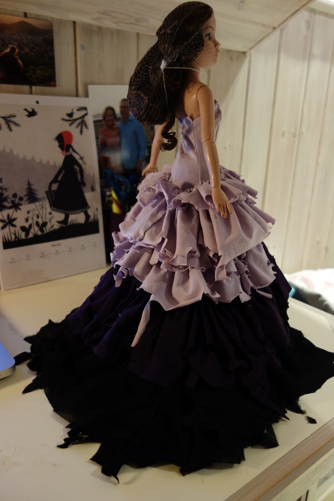
For Lilac, I didn’t like where the mask idea was heading. It looked too much like those commedia d’ell arte looks. However, I still liked the idea of hiding the eyes, as if suggesting them being closed for sleep. I then remembered the image of the Greek Goddess Nemesis, with half of her mysteriously covered by this black cloth that hides her eyes. The effect is so simple yet subtle, it’s perfect for Lilac’s narcolepsy theme.


Her wings I’ve always envisioned being long, sleek and flowing down on the ground, more like a heavy cloak with frayed ‘moth eaten’ edges. This makes her walk have this amazing train behind her, like how she drags the sleeping curse everywhere with her.


Saturday, 11 May 2013

Sugar Plum Fairy, so sticky n' sweet...


It feels weird, designing an outfit for what I think of as the Poster Girl for the Holiday season in the beginning of May. But I’ve got so many ideas for it, I can’t resist!


The Sugar Plum Fairy from the Nutcracker ballet has always been viewed as graceful, gorgeous, the epitome of the magical sugar world Clara finds herself in. So I was intrigued by Matthew Bourne’s vision, where Candyland is this toxically alluring realm, and the Sugar Princess is actually Clara’s rival. Here the Sugar Plum Fairy represents the dark side of sweets, it’s grosser aspects (it’s sticky texture, it’s artificial coloring in her hot pink gown.) It’s all so brilliantly reincarnated!

I’ve been listening to the soundtrack for the film Hansel and Gretel; Witch Hunters. The track ‘Don’t Eat the Candy’ is very chilling yet amusing with the sound effects of kids licking their fingertips. 


Nikki Minaj is another inspiration for this character, with her vibrant color choices and girly rock frocks. When putting together my moodboard, I researched ‘Nikki Minaj Prom Dresses’, and was amazed with the results that came up! Pink was always the foundation shade for this look, and not that magenta shade I love, but a tackier pink-think that Barbie birthday cake you had when you were six. However, the ‘Plum’ aspect of the character calls for purple, which would add to the artificial coloring palette I want to invoke, suggesting all the food coloring used in the candy industry.


For my first sketch, I’d always envisioned using a lollipop swirl strip, looping around the bodice as if the dress is oozing off of the doll. But in the transition to the full length skirt, I remembered this Monster High dress design for Snow bite, how the top layer of the dress having this acidic dripping effect. That dripping effect would really present that sticky element. For the skirt, I’ve got a couple of things in mind, along the lines of candy wrappers being stuck on. Also I’ll be using pink and purple rhinestones to suggest that glittery detail in iced sugar. 

I can’t wait to get started! It’s gaudy, tacky, yet whimsical and bright. 


Friday, 10 May 2013

Tinkerbell Hits the Stage...


Three fairies down, four to go!

It was really refreshing to work with a colour other than black. The 'petal' layered look I created, inspired by the dress designed on Project Runway, Season 7 in the episode 'the Fashion Farm'. It has lots of fluffy bounce to it, something I've loved so far in all this Fairy couture. I was amused when I first stitched on the olive green sequins onto the pointed sections of each layered, when I first looked at it, a voice in my head screamed 'NOT GLITTERY ENOUGH'. Sometimes, there just ain't enough rhinestones, ha?


This week, I went through three different ‘swagger vests’ for this Tinkerbell look, and was on the verge of totally tossing the idea aside. Almost.


The problem was that the design in my original sketch never came out the way I imagined it. So instead of fighting a loosing battle with the original pattern, I went and made a fresh start on a new vest, this time covering it in sequins. But after stitching a bunch of the plastic stones on, I felt the garment just looked tacky, like a cheap magician’s costume. However, it did give me the idea of making a bejewelled neckpiece that really strikes the eye and beautifully compliments the simplicity of the bodice.


By at this point, even though I was pleased with the overall look at that point, I longed for those broadened shoulders and impact the vest would ultimately make. So yesterday afternoon I gave it one last shot, making a third template. Only this time, I decided to create that furry flare draped effect by applying the same layered patterns I’d used on the skirt. The end result wasn’t as bold and Beyonce as I was hoping it would be, but it looks amazing against the sequined necklace!


This completed look is as close to my original sketch as I could wish for. This whole Fairy project has enlightened me to the process of multiple attempts to get the results you want. The process is still frustrating, and when you spend so much time on one piece it can drive you artistically insane. But I’m still proud of what I accomplished in the end, but I’m more than ready to be done with the Tinkerbell dress.


Sunday, 28 April 2013

Tinkerbell


Move over, ladies. The beyatch is in the house! Tinkerbell, the Queen Bee of the Fairy universe. During the first sketches of this collection, I knew exactly how I wanted to portray her; a total Diva! 
Tink’s not your typical sweet little fairy. She’s snappy, spoilt, even malicious at times, and always determined to be the centre of attention, not to mention the only woman in Peter Pan’s life. I’ve always felt Disney made her kinda riskae-I mean, how short is that minidress? She’s like an animated mini Marilyn Monroe! 


The basis of my Tinkerbell look will be drawing elements from the traditional fairy costumes-layers of fabric cut into petal shapes, leaf like curves and cuts that shape the bodice. Think Tinkerbell as Prom Queen with the extended skirt. I did a full character sketch, like I did for my Twisted Fairy Tales series-putting the whole look in a full water colour painting helps give me more sense of the three-dimensional design itself, as oppose to a basic garment outline as seen below:


And what is Tink’s primary function? Spreading pixie dust! That shower of glitter she spreads reminded me of the outrageous sparkle-cluttered costumes worn on stage by ladies from Beyonce to Britney, exuding glamour and power. She’s all about the presentation, this fairy. So I’ll be showering rhinestones all over this dress. 
Finally, true divas always wear a stole or some kind of jacket, broadening their shoulders and giving their more swagger in their stance. This would make the whole look more modern, though I’m not sure how to achieve that volume it needs to give the shoulders (somehow I don’t see Tink being a fur-fan). Also I’m still struck on the wings, since all I can think of is traditional butterfly wings. Check out my moodboard. Practice pieces soon to come!


Saturday, 27 April 2013

Fairy Godmother Complete


Finally, after weeks of trying to create the perfect bustle pattern, making practice pieces over and over, changing and re-sketching the design, the Fairy Godmother look is done. 


As predicted, when hand stitching the bustles to the skirt, I did experience that ‘crap, this looks like a bumblebee ball gown’ moment. Adding the gold ribbons not only added volume and but depth so the bustles didn’t seem like an after thought on the black dress. Also adding those short puffed sleeves blended the bodice to the skirt more fluidly. 


Adding the wings on, I realized that the hair for this look needs to be styled up. I’m contemplating doing a sort of Grecian goddess hairdo, with gold and black ribbon wound around the hair, but am a little scared this will relate too literally to the Disney Cinderella look (I’ve always hated that headband thing.) I’ll experiment a bit first before the actual shoot.

I guess when you spend so much time on a project, trying to make it perfect that you loose that drive you originally had when first starting off. Now that it’s done, it’s refreshing to step back and let the gown have a life of its own. I’m totally ready to move on to the next fairy...see next post for more details!


Sunday, 14 April 2013

Fairies Collection: The Fairy Godmother


Next project: the Fairy Godmother! Yes, the most matronly of the Fairy crowd, and usually represented as this dumpy old lady. She’s a mentor, giving Cinderella that little push out the door with a few bare essentials (coach, dress etc. ) to get her dreams going. But what kinda bugs me about the Fairy Godmother character is why, for the first time in her so called godchild’s life, she decides to show up then and there? What’s up with that? Sure, Cinderella’s parents have died, leaving her to a ruthless step mother and step siblings who make her life a living hell, but god forbid she misses out on a party?! 
Bad timing aside, my inspiration on creating a new Fairy Godmother from how I’ve always pictured her as this seamstress. I think of her as the fashion designer of the Fairytale universe, and plan to make her the epitome of couture. Her gown will be an explosion of materials and a celebration of sewing techniques. Here is my mood board.


Considering color palette, my first choice of color was naturally the staple of any fashion house; black. Then, for that ethereal glamour I’ve chosen gold. But until it all comes together, I have this nagging feeling that she’s going to look a giant bumble bee...
The bodice was a real test. Staying true to the concept of couture, I wanted a basic corset shape, but to experiment with draping. I chose a rusty gold jersey base, with layers of black chiffon rippling in pleats on top. This was tricky, and I had to pay more attention to the edges, as well as sew the pleats onto the jersey base first THEN sew each panel together. Also, in case the bodice was too constricted or small, I left the back open, and will closed it with ribbon lacing to be sure the doll could get into the bodice. I’m disappointed that the black chiffon folds block the gold underneath, but for a first shot at this technique, it’s really got a real 50’s glamor to it.
Here's my final sketch. To be true to the history of ball gown making, I’ll be covering the wide skirt in gold gathered bustles. I’ve been experimented with different patterns lately (one reason why this post was so delayed), but think I’ve finally nailed a good pattern to attach over the skirt. I’ve got two practice pieces (one smaller bustle to attach to the  beginning of the skirt, the second larger for more volume more at the hem). I can’t do more until I’m sure the patterns work.


It’s dawned on me that this collection is missing one key element of my design aesthetic; a cohesive detail. Take my Twisted Tales collection, the skull beads somehow featuring in each look to connect it to the rest of the collection. So, inspired by the wings on the Victoria’s Secret runway, I’ve thought of ways to make wings for each individual fairy! 


For example, the dress worn by Lily Collins in the film Mirror Mirror with the massive looped yellow ribbons in the back I thought sort of looked like wings. Using some wired gold ribbon looped to resemble the shape of wings while staying true to the ‘seamstress’ concept my Fairy Godmother. 

Saturday, 9 March 2013

The Lilac Fairy


After seeing Matthew Bourne’s production of Sleeping Beauty at Sadler Wells in January, the fairy costumes alone were one of the elements that inspired me to do this collection. The skirts a soft light weight fabric that started in color then descended into darker shades at the hem were gorgeous, making them gritty yet ethereal.

The Lilac Fairy in most interpretations of Sleeping Beauty is seen as this wise guiding figure for the two protagonists. I disagree-she’s not really a ‘Good’ Fairy, unless by the word ‘Good’ you mean ‘Ok’ or ‘Fine’. In averting Carabosse’s curse, all she really does it complicate things, making everyone in the castle comatose for a century! 


The overall concept for this character is Narcolepsy. In staying true to the character’s title I knew purples would be a major color choice, but like the New Adventure costumes I loved the fusing of the brighter color on the corsets transforming into black tones by the edge of the skirt hem, as if suggesting the gradual descent into sleep. This was where I thought of a light colored bodice that would shift into darker shades through the billowing layers of a massive gown. Also for this design I reincarnated my ‘The Dog Ate My Prom Dress’ technique I made up a few years ago, taking layers of gathered fabric and shredding it’s edge. The effect looks as if the dress’s been dragged through the hedge.


The light weight and volume of the gown came out beautifully, particularly the darker violent between the lilac and black layers making a smooth transition in the color palette. However the weight of the skirt was so heavy, I had therefor reconsider the sleeveless bodice idea. The ruffled halter top Mila Kunis wore for the cover of Sunday Times Style magazine inspired me to compromise the shredded gathered ruffles in the front to hide the halter additions, the ruffles merging at the waist line with the rest of the skirt! The effect is much more editorial than my original design. 


The mask was inspired also from the eye make up of the fairies from the Matthew Bourne production, the black strip making a mask like shape around the eyes. The idea intrigued me as it seemed to suggest sleep, so I redid it into a physical mask with black netting, in the style of the headwear worn at ascot covering the face.